
Pushing the Wrong Buttons: Car Tech's Reality Check
As Hyundai leads the return to physical buttons, has the automotive industry's digital romance finally hit a dead end?
Picture yourself driving down a winding road on a chilly morning, trying to crank up the heat. Your finger hovers over the sleek touchscreen, attempting to hit that perfect spot on the temperature slider. Miss. Try again. Miss again. Now you're distracted, your eyes darting between the road and this digital puzzle, all while trying to maintain your lane position. Frustrating, isn't it? This isn't just my personal gripe – it's become a universal pain point in modern cars, and finally, automakers are listening. In a delightfully ironic twist that proves life does come full circle, Hyundai just announced they're bringing back physical buttons in their new cars, marking a significant shift in automotive interface design.
Change is inevitable but not necessarily pleasant, especially when it comes to technology. While enthusiasts are slowly warming up to the idea of electric vehicles, the paradigm shift to a unified touchscreen display for all controls has yet to win favor among patrons. Digital clusters have replaced the dashboard with cutting-edge visuals and provide a plethora of information in your field of view, while the infotainment system, which initially served as the medium for media and GPS, has slowly started integrating other functions of the vehicle, including the HVAC controls. As someone who considers themselves more than tech-savvy and eagerly embraces the latest innovations, even I find myself wrestling with these touch-based systems. Don't get me wrong – I'm not against digital interfaces or touchscreens. In fact, I admire these technological breakthroughs and their potential to revolutionize our driving experience. But there's a significant difference between innovation that enhances our driving experience and change that complicates it. The climate control interface, in particular, has been so heavily butchered from a driver's point of view in almost all modern cars that it's become a textbook example of fixing something that wasn't broken.
The Great Button Exodus
Remember when Honda had to backtrack and replace their touch strip with a physical volume dial in the 10th Gen Civic? They weren't alone in this dance of digital regret. Porsche, the epitome of luxury and innovation, recently ditched their touch panel climate controls and switched back to manual air vent controls in the 2024 Cayenne, acknowledging that sometimes simpler is better. And let's not forget Volkswagen's ambitious but ill-fated "touch everything" approach in their ID line – an experiment that earned them more ridicule than praise. Their touch-based temperature slider without any illumination in the GTI became a symbol of prioritizing style over substance, though they've finally addressed this in their latest update by illuminating the strip. This pattern of retreat from touch-only interfaces speaks volumes about the gap between technological possibility and practical usability.

The Digital Dashboard Dilemma
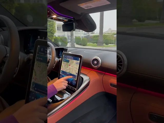
Take my experience with my S650 Ford Mustang. The dashboard is a visual feast with its integrated cockpit and high-resolution graphics. The customization options are endless, and the display quality is stunning, offering a truly modern driving experience. But try adjusting the fan speed, and suddenly you're dealing with a superimposed menu that blocks your navigation map. It's like having a beautiful painting covered by a Post-it note – functional, perhaps, but hardly ideal. Ironically, it's not the worst implementation I have seen. In iDrive 8.5 and Rivian, the entire screen switches to a ventilation menu when you try to adjust the fan speed, completely interrupting whatever information you were viewing. While Volkswagen had a similar interface, they have addressed this issue by upgrading to bigger displays in newer models. In my opinion, critical functions like volume and track control should have their own menu system that operates on a different section of display and isn't hindered by any other function. Mercedes-Benz has figured this out and has executed it flawlessly in the MBUX system.

The Mercedes Exception
Not all touch interfaces are created equal, though. Mercedes-Benz has managed to crack the code with their MBUX system, creating an interface that's actually a joy to use. Their secret? A thoughtfully designed waterfall-style portrait display that keeps climate controls in their own permanent section, allowing drivers to maintain access to crucial functions without disrupting other features. This simple yet brilliant solution shows that with proper implementation, digital controls can enhance rather than hinder the driving experience. MBUX also features a floating bar called Zero Layer which Mercedes describes as MBUX Zero Layer simplifies the operation of the multimedia system by displaying applications at the top menu level on the home screen situationally and contextually to reflect the current situation. MBUX Zero Layer offers a 100% personalised and intuitive user experience, with all relevant functions always in view.

The attention to detail in terms of user experience doesn’t stop there, the new generation of cabriolets (convertibles) by Mercedes Benz employ an ingenious mechanism that aims to reduce glare when one drives with the roof down by adjusting the tilt angle of the display from 12 to 32 degrees.
While I might be impressed with the MBUX system, the decision to replace physical buttons with touch-sensitive strips in the newer generation of Mercedes is yet to win hearts. It seems that even the pioneers of intuitive digital interfaces couldn't resist the allure of minimalist design at the expense of functionality.
The Evolution of Car Interfaces
The journey from knobs and buttons to touchscreens didn't happen overnight. Starting with basic radios and mechanical controls, we progressed to digital displays in luxury vehicles during the 1980s, when the first LCD screens seemed like science fiction come to life. The 1990s brought us integrated navigation systems, and gradually, these separate systems began converging into what we now know as modern infotainment systems. This evolution reflects not just technological advancement, but also our changing relationship with our vehicles, as cars transformed from simple modes of transportation into rolling computers.
The Software Revolution
The rise of Software Defined Vehicles (SDV) made touchscreens an attractive option for manufacturers. They're cheaper to produce, easier to update, and offer endless customization possibilities that would be impossible with traditional buttons and knobs. But this digital transformation came with hidden costs – namely, user experience and safety. While auto climate control works perfectly most of the time, the need for quick adjustments hasn't disappeared, and that's where touch interfaces often fall short. While some might argue that with the advent of Advanced Driver Assistance & Autonomous Driving Systems (ADAS/AD), drivers will have the luxury to navigate complicated displays without risking others. This might sound plausible in the near future, but right now SAE Level 2 is the most widely available ADAS/AD system in most consumer cars. Level 3 and above is advisable if you intend to shift your focus from the road, but that future isn't as near as expected, as it's riddled with regulatory speed bumps and technological challenges.
The Cost of Progress
The industry's shift toward unified touchscreen displays hasn't just changed how we interact with our cars; it's fundamentally altered the driving experience, and not always for the better. While digital clusters have replaced traditional dashboards with cutting-edge visuals and information, the integration of HVAC controls into touch interfaces has proven to be a step too far for many drivers. Some manufacturers have tried to find middle ground with solutions like touch sliders, but these compromises often feel like band-aids on a deeper issue. The real cost isn't just in terms of user satisfaction – it's about safety and the core pleasure of driving, which shouldn't be compromised in the name of technological advancement.
Tactile exodus or renaissance?
The recent trend of manufacturers reintroducing physical controls marks a fascinating shift in automotive design philosophy. It's a humble acknowledgment that sometimes, the old ways work best, and that innovation doesn't always mean replacing everything that came before. This isn't about resisting progress – it's about recognizing that true innovation should enhance our experience, not complicate it. The return to physical controls represents a more nuanced understanding of human-machine interaction, where the best solution isn't always the most technologically advanced one.
As we watch this gradual return to physical controls, we're left with some intriguing questions: Did we mistake complexity for progress? In our rush to digitize everything, did we forget that the best interface is often the one you don't have to think about? And perhaps most importantly, what does this mean for the future of automotive design? As manufacturers continue to balance innovation with usability, we might be entering an era where the best solutions combine the reliability of physical controls with the flexibility of digital interfaces. What's your take – are you celebrating this return to tactile controls, or do you think touchscreens still hold the key to our automotive future? The answer might shape not just how we interact with our cars, but how we think about progress itself.